
flag design rules
good flag design
The following five rules represent the key tenets behind each Cleveland flag redesign. This blueprint, coupled with core design principles of balance, contrast, alignment, proximity and repetition ensure Cleveland’s new flag will be an enduring symbol of the city for years to come.
North American Vexillological Association (NAVA) member and author Ted Kaye presents five basic good flag design principles in his book Good Flag, Bad Flag. Kaye's rules for good flag design are:
1. keep it simple
The flag should be so simple that a child can draw it from memory.
Cleveland's flag is slathered in tiny details that are costly to produce and difficult to see at a distance. Inscrutable symbols of yesteryear are stacked three deep at the top left and right of the flag, making identification near impossible.

2. use meaningful symbols
The flag’s images, colors, or patterns should relate to what it symbolizes.
Cleveland's flag includes pictographic, not symbolic, representations of blacksmith tools and sailing ship equipment. Any relevant meaning is lost on a contemporary audience.

3. use few basic colors
Limit the number of colors on the flag to three, which contrast well and come from the standard color set.
Cleveland’s flag uses four colors: red, white, blue and green.

4. no lettering or seals
Never use writing of any kind or an organization’s seal.
Cleveland’s flag is stuffed with text. A flag should never be labeled with a city, state or country name. “Cleveland,” “1796” and “Progress and Prosperity” have to go. Flags are meant to be seen at a distance. Seals and lettering are for paper, up close, not fluttering in the breeze at the top of a flagpole. City seals, often packed with civic imagery, fail on city flags. While dense with imagery, they lack symbolism. They are overly detailed and not meant to be viewed moving at a distance and represent the city’s government and not the people. A city seal is for elected city officials and official city business. A city flag is for the people. The average citizen is not permitted to use a city’s official seal. To balance this, a city’s civic body should adopt the people’s flag and not impose a governmental seal upon the public.
5. distinctive or related
Avoid duplicating other flags, but use similarities to show connections.
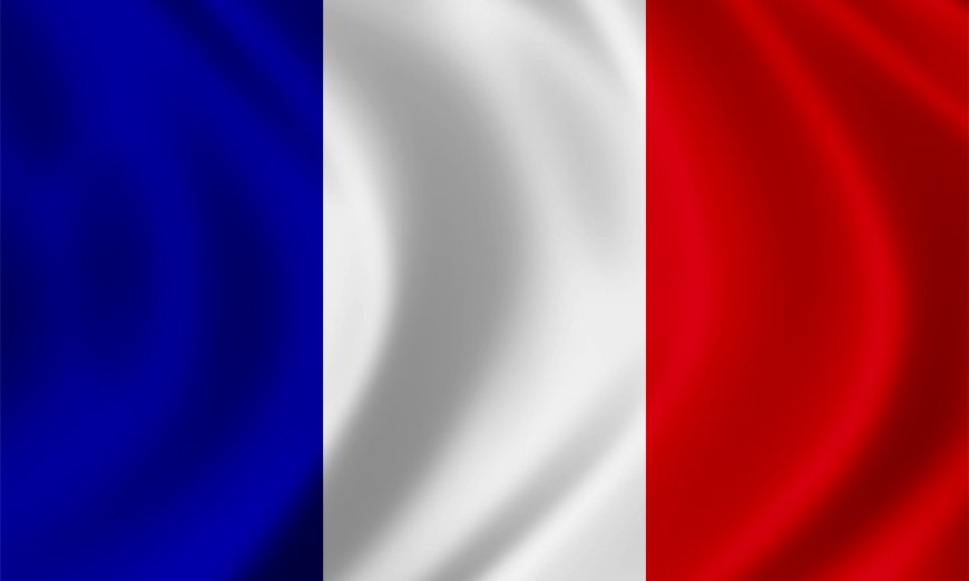
The red, white and blue on the Cleveland flag creates a visual relationship between the Cleveland, Ohio and American flags. However, the Cleveland flag isn't distinctive. Its broad, vertical tri-color stripes are a common device on many flags. This can cause the current Cleveland flag to easily be confused for the flag of France, which appears below.
pro tip: design small
When designing a new flag, first draw a small one by one-and-a-half-inch box. Design the new flag in this small box. A three-foot by five-foot flag atop a flagpole100 feet away appears the same as a one-inch by one-and-a-half inch drawn flag design 15 inches from your eye. Keep the flag design legible at a small size and the finished flag will look good at a distance.
what remains
Not much of value remains after the rules of good flag design are applied to Cleveland’s current flag. The text and tiny details are gone, as is the fourth color. What remains is a red, white and blue tri-color flag with the outline of a shield. Cleveland deserves a flag that stands as a vibrant and unique symbol of the city. Not this. View new Cleveland flag designs.

sport teams
A city flag should represent the city, not a team. A city isn’t a sports team. No matter how much city residents love a team, a team can always leave. It’s tempting to want a city flag to include a popular team, however a sports team does not represent an entire city.
Professional sports teams have massive marketing budgets and lucrative licensing agreements to put their team colors and logos on merchandise, including flags. Flying a team flag indicates to others you support that team, but not necessarily the city. For this reason, a city flag needs to be independent of a team flag. People can always buy one of each and show support of their team and their city.
The following is a partial list of a few Cleveland teams that left Cleveland, Ohio: Cleveland Barons (left three times), Cleveland Crusaders, Cleveland Crush, Cleveland Force, Cleveland Gladiators, Cleveland Lumberjacks, Cleveland Rockers and last, but not least, the Cleveland Browns, who moved to Baltimore, Maryland, in 1995. Designing a city flag around any of these teams would look foolish now that they have left. View a complete list of former Cleveland sports teams.

city flags
In 2016, Roman Mars, host of the podcast 99 Percent Invisible, presented a TED Talk about flags and flag design. This talk spurned a revolution in flag design, introduced the rules of good flag design to a cadre of civic-minded flag designers and dropkicked the word vexillology (the study of flags) into the mainstream vernacular.
flag design
In 2021, Flags for Good Founder Michael Green gave a TED Talk in which he discusses the value of flags as symbols of communication and belonging.