cleveland flag
about flag 15
Cleveland flag redesign fifteen captures the spirit of the city’s progress and reinvention. Throughout the last few decades, Cleveland has transformed into a thriving metropolitan community. After years of shedding business and residents, the city is making a comeback. People are moving downtown. No longer represented by steel and heavy manufacturing; healthcare, technology, finance and education now define Cleveland’s economic landscape.
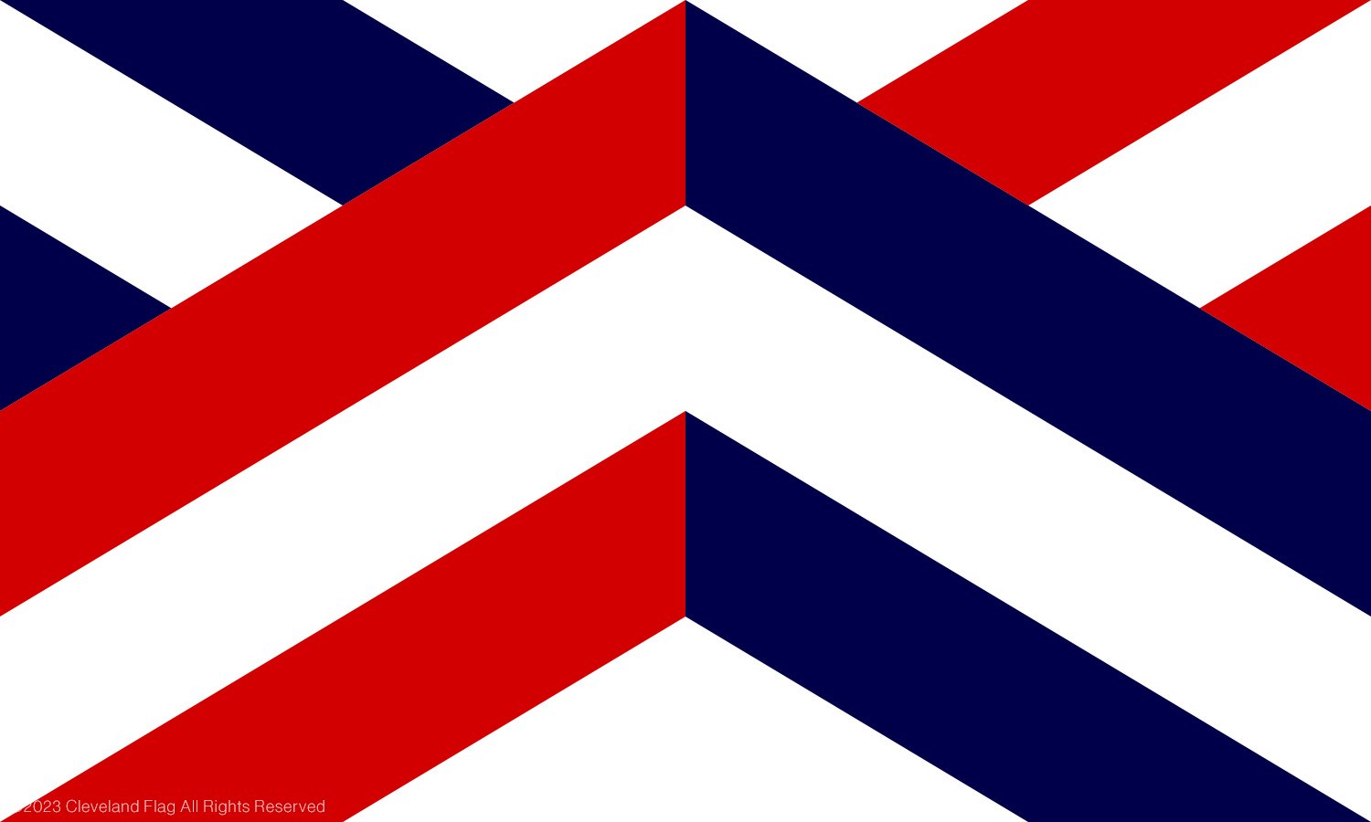
Large red, white and blue chevrons point upward, symbolizing progress, positivity and growth. Two red stripes start at the flag’s lower hoist (left) side and move upward to the flag’s center, where they are joined by two blue lines moving upward from the flag’s fly (right) side. The lines are separated by a white chevron.
The red, white and blue color scheme comes from the city of Cleveland’s current flag, the Ohio flag and United States of America flag. The flag’s design mixes together the stripes and triangle shape from the Ohio flag with the chevron pattern found in Moses Cleaveland’s family coat of arms. Moses Cleaveland founded the city of Cleveland in 1796.
The color white represents community. Red stands for integrity. Blue stands for fidelity.
This new city of Cleveland flag redesign is built on a 1:8 grid. See other Ohio city flags.